Urbanworld Film Festival 2024

Movie Review Coming Soon!

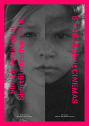
Directed by by Frank Sputh, Bin Martha, Kolumbianerin (I'm Martha, Colombian) is a slowcumentary, the nearly three-hour portrait of a young Afro-Colombian woman, a slow, closely observing documentary.

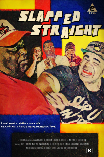
Watch 'Slapped Straight'

Now available to rent for 48 hours.

Give the Gift of World Cinema! Order The Madlab Post eGift Cards

Expressway Cinema Rentals is Philadelphia's leading photo & video rental resource for the creative community.

Visual Jedi LLC | Specializing in Video Production from concept to creation. Storyboard, audio mixing, editing, graphics design and more!

Pour something different! Premium specialty loose leaf teas sourced in Africa. Sibahle - We Are Beautiful!

The Ultimate Vegan Experience! We are Vegan Soul. Celebrate a new way of life with healthier food.

Fine Art Reproductions - Limited Edition Giclees on Canvas and Limited Edition Prints by World-Renowned Visual Artist and Designer, Synthia SAINT JAMES


Read my A to Z Reflections:

The Madlab Post is Home to the weekly Monday Movie Meme: Signup!

Are you ready for the best blog hop on the net? #atozchallenge

*All 31 "Prompts" might not be featured on this blog; I have my own schedule and topics to adhere to.

Your ad could be here, right now.

Search

Come SUPPORT the makers and SHOP for the holidays at MADE@BOK Small Biz Saturday Market where you can get a head start on The Madlab Post’s Shop Small Treasure Hunt with movie tickets, videogames and more! This is a market featuring crafts from artists, designers, makers and small businesses that create within the walls of the historic Bok building. Free entry!

FOR YOUR CONSIDERATION:
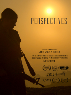
Perspectives directed by Neer Shelter has qualfied for the 2024 Academy Awards

WATCH IT NOW

#Oscars #Shortlist

FYC: Academy qualified short film 'Perspectives' directed by Neer Shelter | Oscars Shortlist

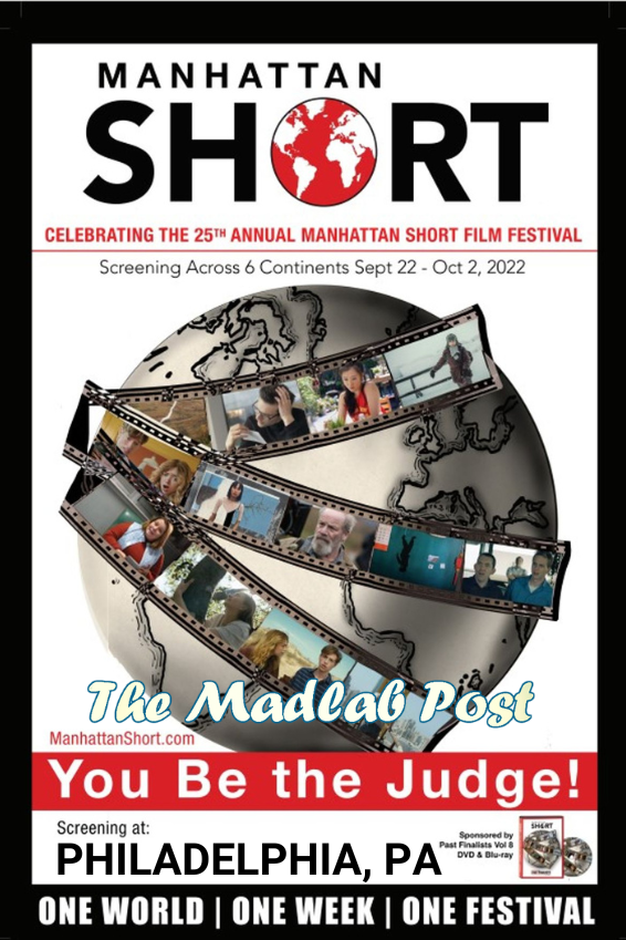
MANHATTAN SHORT ADVANCE SCREENING PASSES NOW AVAILABLE. 

RESERVE YOUR SEAT

📣 MADE @ BOK SPRING MARKET IS HERE 📣 Our first Market of 2022! On Sunday, May 1st from 11-4pm, come grab a gift for mom, a treat for your loves or something to brighten up your life in the way only springtime can like clothing, jewelry, ceramic and vintage wares, a brownie or two (or five), and more! 🤗 We'll be setting up in the gym as well as all the shops in retail row through the (new and improved!) Dudley St door.

See you then! ❤️🧡💛💚💙💜🤎🖤🤍

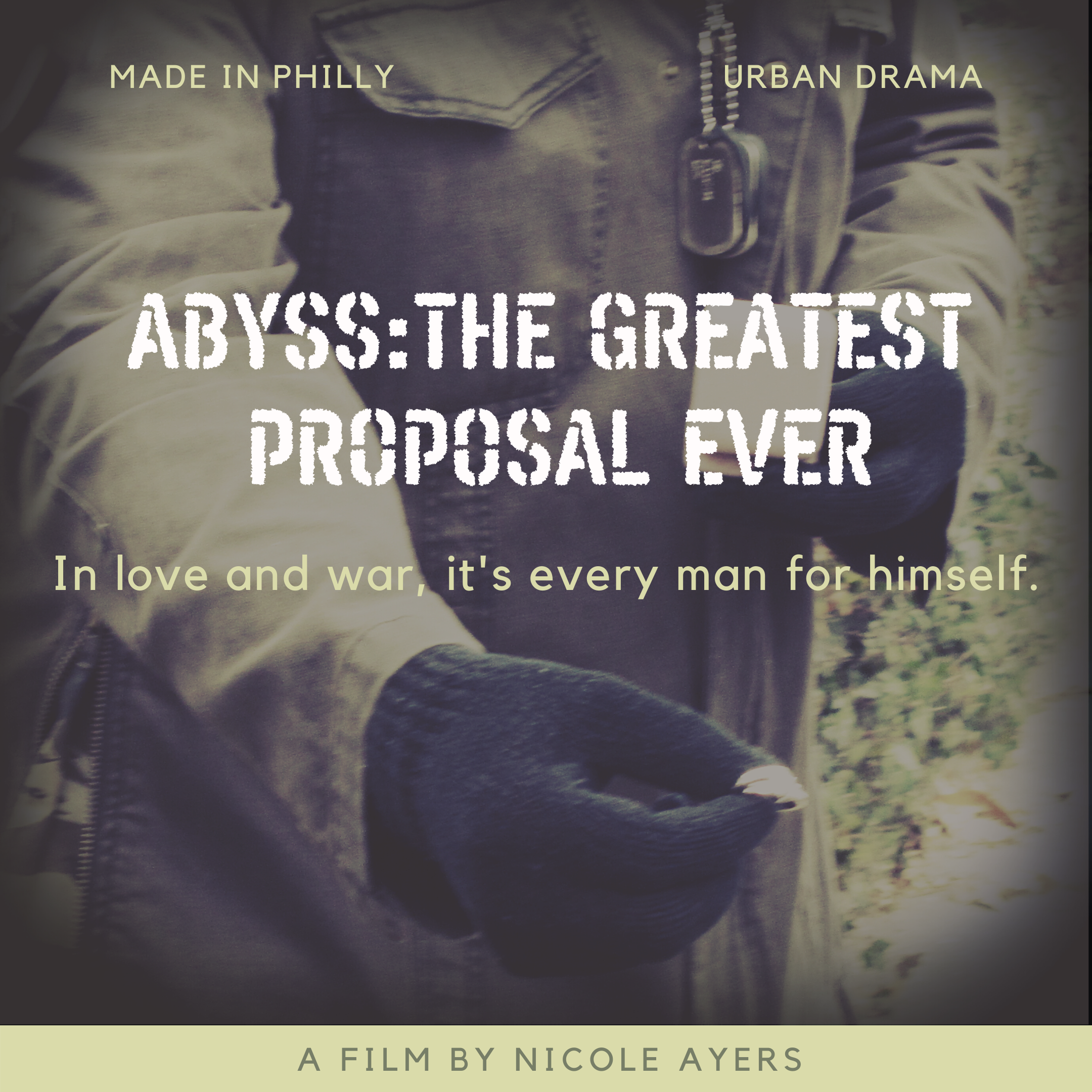
Rent Abyss: The Greated Proposal Ever, a short film made with a diverse cast & crew working together to tell a story about Love, Friendship and PTSD! This urban military homecoming drama is a candid glimpse into the troubles surrounding a U.S. Army Sergeant who gets stranded by SEPTA in the inner city when a wild marriage proposal shakes up his plans to reunite with the only family he knows. 

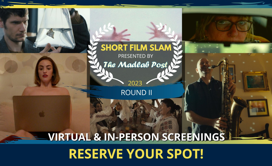
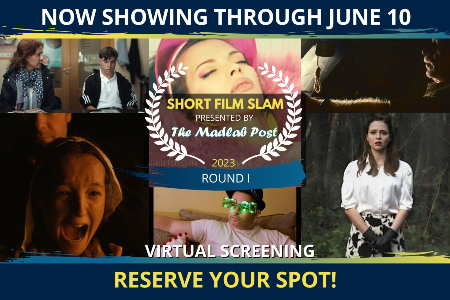
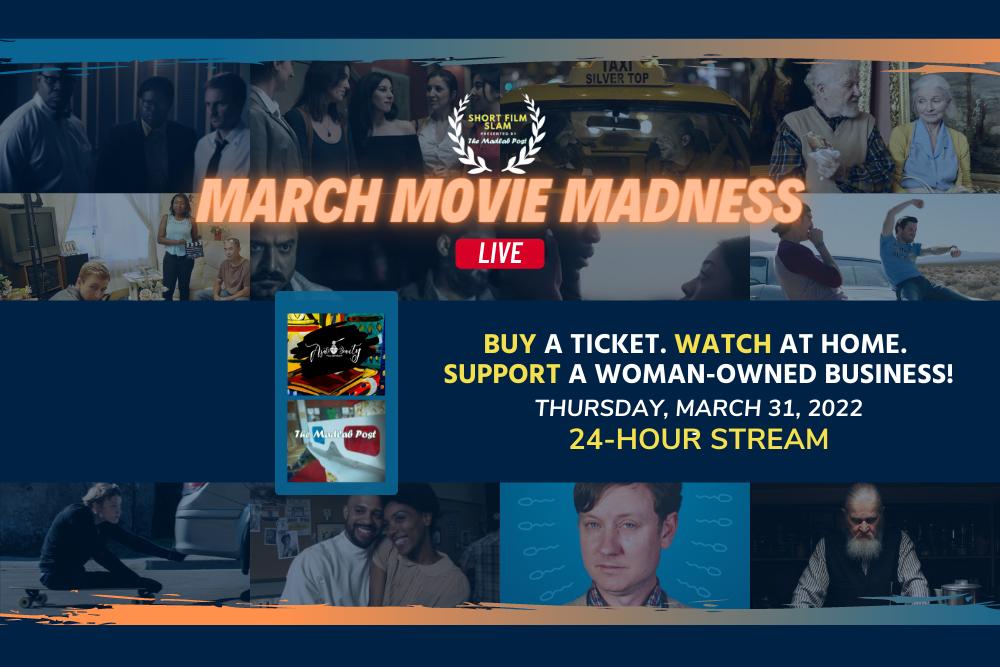
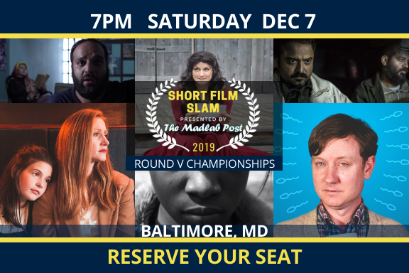
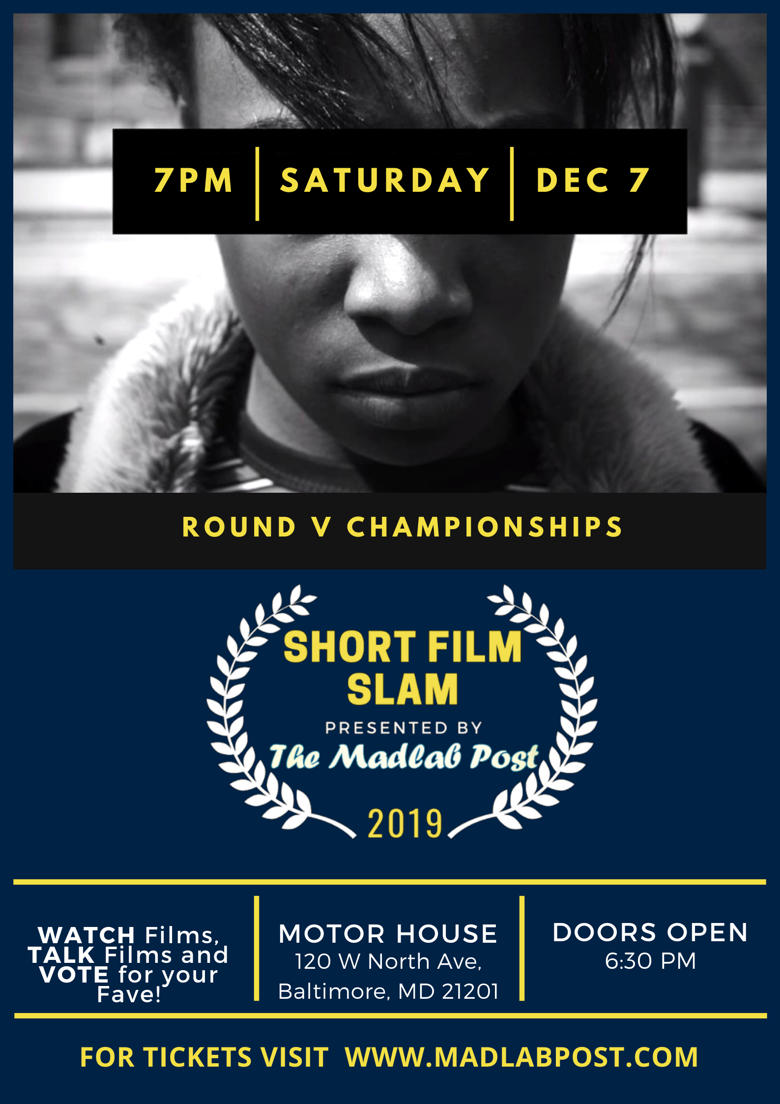
The 2019 Short Film Slam Round V Championships is showing at Motor House in Baltimore, MD. Visit the Shop for Advance Tickets to our awards showcase!

UPCOMING SCREENINGS:

GET TICKETS!

GET TICKETS!

GET TICKETS!
RESERVE YOUR SEAT for February - March 2019!

--------------------------------

The Madlab Post showed all of the 2019 OSCAR Nominees for Best Short Film in the Animation, Live Action and Documentary categories earlier this year. Missed the show? Get on our mailing list!


Bring The Madlab Post to You!

Enter your email address:

Delivered by FeedBurner

Entries in Abyss Movie (32)

Wednesday
Dec182013

The Greatest Proposal Ever – A Movie Poster Reveal and World Premiere Screening Event

It’s official. After analyzing elements of various movie poster trends, my short film “ABYSS: The Greatest Proposal Ever” (TGPE) finally has some key art! I find it funny how much of the inspiration for the final concept came from some of the most unlikely sources.

Rather than worrying myself silly about how to come up with a super creative, ultra clever design for the movie poster; how to convince someone to make one for me; how to find money to commission a “proper” design, I went back to the basics. It didn’t take long to get results that I can be satisfied with, thanks to the three things that put the capital P in Productivity -- Pinterest, Polaroid and Palettes.

Who would have thought that the design of this project’s movie poster would be decided based mainly on careful comparisons of material provided by a social photo-sharing service and an electronics manufacturer?! Overall, I’m relieved to have found some workable design concepts when I did, given that the organizers at NewFilmmakers NY has selected “ABYSS: The Greatest Proposal Ever” to screen in their Winter 2014 Screening Series.

The World Premiere of the short film that took me like a whole year to develop – from its script stages to the post-production and beyond – will make its public debut on Wednesday, January 15, 2014 at 7:00pm at the Anthology Film Archives Theater in New York City.

Of all the pleasant feelings I have in being able to screen a project that I’ve spent so much time working on, in an actual movie theater, I’m just as – if not more – enthusiastic to have the opportunity to show my work in (what I believe to be) one of the best places on earth – NEW YOOORK! The concrete jungle where-dreams-are-made-of; there’s-nothing-you-can’t-do! We’re screening in New York, New York, New Yooork!

Thank you all for your continued support over the last twelve months. Here’s to another twelve months of more films, fun, forward movement and free thinking – for each of us and our friends, loved ones and neighbors. It’s crunch time. Are YOU ready?

Sunday
Dec012013

Sunday Synopsis – The ‘ABYSS’ Title Reveal and Monday Movie Meme Update

A few weeks ago, I watched an interview where one guy mentioned how independent films have some of the worse titles. He went on to describe the importance of filmmakers choosing a title that helps audiences get a bit more of an idea on what the movie is about. Not only did I agree with him, it didn’t take long for me to realize that this applies to my current project “ABYSS.”

The title of this short film was about as obscure as one could get. So, I’ve decided to modify the name of the movie little, adding an extension that will hopefully solve the problem of indie films alienating audiences who are wondering “what the heck is this about?” when looking at titles of flicks that were made outside of the Hollywood machine.

Hopefully, the new movie title is less non-descriptive as the former one. Also, the Monday Movie Meme will likely continue to be posted later in the day on Mondays until further notice. Since the theme remains good for one week, I hope that this doesn’t throw anyone off too much or is an inconvenience.

Lately, my schedule and week-to-week offline life has taken up the bulk of my time and energies, what with me writing my first piece for a print publication, prepping for the release of a movie, planning a charitable initiative to help the working homeless, and celebrating special occasions and all. I do not intend for this to be a regular occurrence and will be aiming to publish the Monday Movie Meme themes earlier when able from week to week. Until then, thanks to all of you who read The Madlab Post, all of you who participate in the Monday Movie Meme and all of you who keep up with my movie making journey. Here’s to a bright and joyous December!

How was YOUR Thanksgiving holiday?

Did YOU cook for the holiday or did someone else man the kitchen?
Friday
Nov012013

Movie Poster Trends - Attack of the Clones

Earlier this week, I started worrying less about all of the barriers to entry in prepping my short film “Abyss” for its release; and began to notice the many ways that I can leverage the (albeit limited) resources I already have access to, for maximum options – including the creation of key art. The search for a movie poster design that best represents “Abyss,” however is still on, bringing us to another common trend among one-sheets. 

I figure it’s worth considering any and all viable design concepts that could work while also identifying the ones that should be avoided like the plague.

So with that in mind, let’s look at some movies with posters that could easily pass for another film in front of audiences. In Christophe Courtois’s compilation A little resemblance, he describes how the study of small similarities between one movie poster and another makes a big difference in being able to identify traces of unoriginality among their designs.

It’s hard to argue with his implications after just one glance at these design patterns. Films with movie posters similar to previous releases appear to be riding the bandwagon of another title’s box office success or public status. That should be no surprise considering the nature of Hollywood – the land of questionable sequels and remakes. So it seems as though one-sheets are no exception to this rule. Why reinvent the wheel when another movie has shown that certain compositions, colors, etc. work when it comes to gaining audience recognition?

Movie Poster Trend #12 - The Rip-Off

“These are supposed to either remind you of another (and much better) movie or outright trick you into believing you’re actually getting this other movie at the videostore.” - Para1/ONTD

Call it lack of originality, a case of false advertising, or the simple form of being a downright copycat. One thing’s for sure, movies adopting this “resemblance” practice that Cristophe is referring to has succeeded in getting people to take notice. I have no problem with that, since it is the whole point of creating movie posters. Yet, there is also a part of me that wonders if such a move in design choices are made at the sacrifice of a film’s credibility in terms of its perceived value among audiences.

As “The Rip Off” movie poster trend suggests, some people may view these types of designs as a form of trying to compensate for a film that isn’t so good. On the flipside, one can also argue that similarities in poster designs are useful for helping to give some movies the extra push that they need -- an advantage that would otherwise not be possible due to limitations in their marketing budgets, difficulties in reaching a target demographic, or related factors.

Do YOU still consider movie posters “original” artwork if their designs are similar to notable films?

Is this practice of emulation among poster designs, as understandable as the sampling and/or song remixes done in the music business?

Previous installments of Movie Poster Trends series include a post on hidden face designs and another about text-over-faces

Page 1 ... 3 4 5 6 7 ... 11 Next 3 Entries »